Julieanne Kost
Named one of Fast Company’s “100 Most Creative People in Business,” Julieanne Kost is a Principal Evangelist at Adobe Systems, responsible for fostering relationships with customers through meaningful and inspirational Photoshop and Lightroom instruction. As a highly sought-after speaker for the industry-standard Digital Imaging franchise, she devises and presents motivating and educational training sessions, sharing original techniques and tutorials worldwide — via live events, Adobe.com, her own website (jkost.com) and blog (blogs.adobe.com/jkost). She is also the author of “Window Seat: The Art of Digital Photography and Creative Thinking,” and “Passenger Seat: Creating a Photographic Project from Conception through Execution in Adobe Photoshop Lightroom”, an accomplished photographer and fine artist, and creator and host of the popular Photoshop CC Essential Training and the Art of Photoshop Compositing for Lynda.com, as well as “Revitalize your Workflow with Lightroom” for CreativeLive.
Kost is well-known for her unique approach to instruction, infusing practical tips and tricks with an equal amount of humor and creativity that keeps audiences entertained and engaged. She often serves as a guest lecturer at distinguished photography schools and leading educational institutions around the world. She has created and published more than a thousand instructional videos for Adobe Photoshop and Lightroom. For her outstanding service and contributions to the photographic industry, she received the Gerhard Bakker award from the Professional Photographers of America and was granted the title of Honorary Educational Associate from the American Society of Photographers.
Additional available work can be viewed on her website www.jkost.net
Julieanne is also actively blogging on the latest advances in Adobe software on her blog. An incredible resource for any digital photographer.
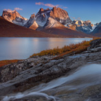
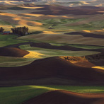
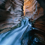
Artist Statement: “Color of Place”
I’ve always been a huge advocate of personal photographic projects and self assignments. They are an excellent way to invest in my own work to ensure my photography evolves, encourage me to look at things with a new perspective and broaden my vision, and challenge myself to improve and keep me passionate about my photography.
So when I recently began to wonder if every location has a unique color palette, I decided it was a project worthy of investigation. From my studies in psychology and photography, I know that color influences our emotions and impacts mood, it also has deeply-rooted symbolic meaning in society and can help to reinforce thoughts and ideologies (consciously or not) and, it can be used to help to create a more unified body of work.
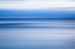
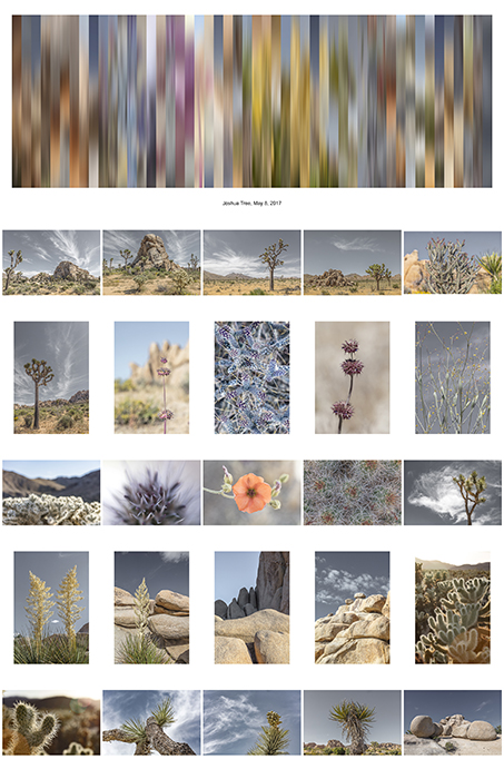
This project was going to be a great way to explore my relationship with color. I began by defining the goals for the project. Working backwards, I knew that I wanted to create images that could be printed at least 6 feet wide. Thus determining the size of the images that I needed to work with. I also decided that I wanted to create a minimum of 25 images, each from a unique location around the world. I identified the locations and wrote them down to help me track my progress as I worked through them.
I also decided on a time frame – I give myself six weeks to complete the project. I had a head start as I had worked on three similar images earlier in the year – however I knew that I would need to redo these images at a larger size as well as find ways to increase my productivity as each of the first images took several days to create. I began by choosing 50 images from the first location which I felt best represented the colors of that individual location and used Photoshop to blur them. I then selected a strip from each image which would become one of the 50 one-inch color bands in the final panoramic image.
Once I worked through the process on several images, I looked for ways to increase my efficiency. I recorded several actions in Photoshop to help create the canvas, add guides, blur the images, distribute the slices, and create the border. However cropping the images (I subjectively chose sections of each image) and the order in which the slices were arranged (an infinite number of possibilities!) was still a manual process.
At first I had decided to put the slices from each image in the order in which they were captured, but that didn’t always lead to aesthetically pleasing images so I took artistic license when needed to rearrange the order of the slices.
This project presented several personal insights as well as raised a number of questions. While I found that every location did, indeed have a unique color palette specific to the time of my visit, the color palette that I chose to
represent that location was based on several internal and external biases.
Quick Description of “Passenger Seat”
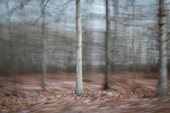
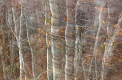
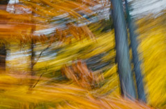
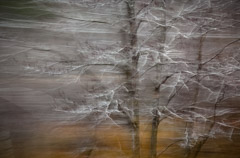
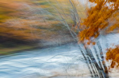
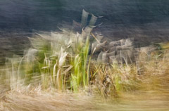
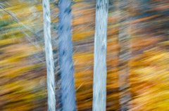
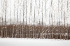
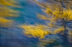
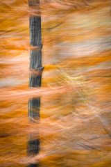
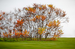
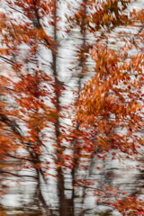
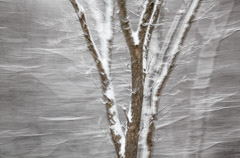
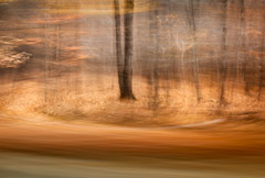
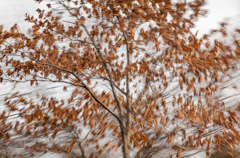
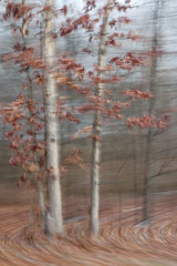
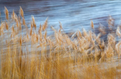
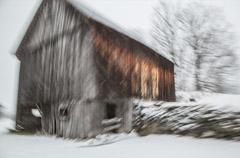
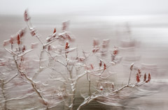
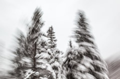
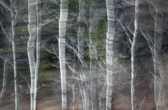
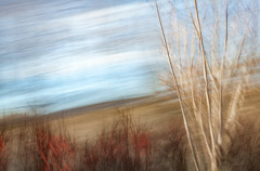
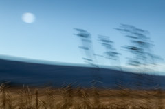
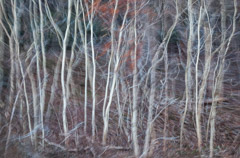
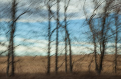
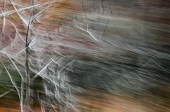
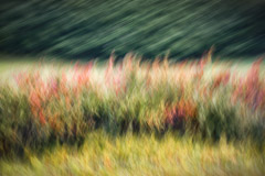
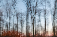
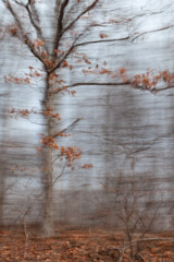
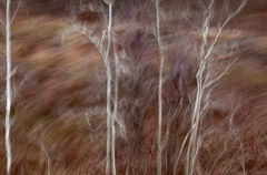
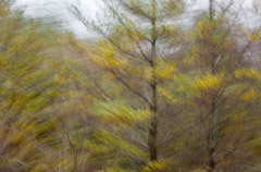
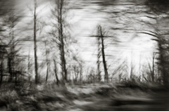
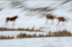
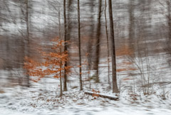
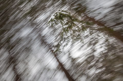
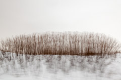
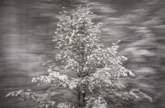
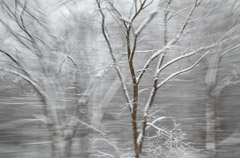
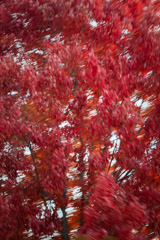
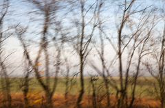
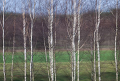
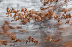
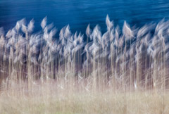
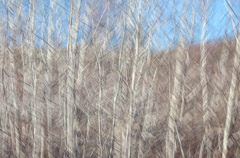
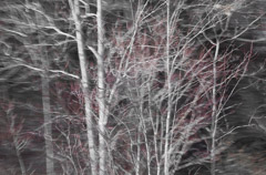
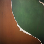
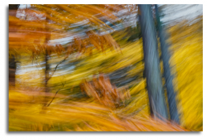
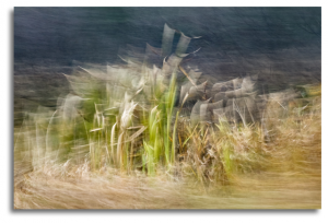
Passenger Seat started as a purely personal project as I traveled through the northeastern United States to view the leaves in fall. We drove all day looking for iconic New England landscapes, and between the small towns, I started taking images out the window of the car. At the end of the day, the images that I had made “in between” were the images that resonated with me. I found myself capturing a distinct yet ephemeral moment that was not entirely apparent or observable when the image was made, yet these photographs conveyed the mood, colors, and transient notion of fall better than anything that I had mindfully composed.
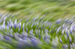
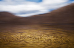
Because I was relying on the camera to capture an image that I couldn’t observe with my own eyes, it was necessary to capture the blur in each image—entirely in camera. Although I could have tried to add a sense of motion in post-processing with Photoshop, these images would have been very difficult (if not impossible) to mask and realistically blur in post because of the overlapping elements.
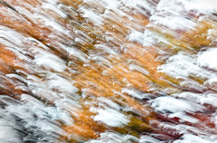
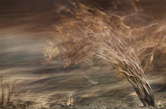
The basic premise for capturing these photos was fairly simple. Because all the images were taken while moving forward in some type of vehicle (most often from the passenger seat of a car, with a few exceptions for trains and buses), I slowed down the shutter speed and then panned the camera, trying to stay focused on my subject (a tree for example) as the vehicle drove by. As a result, the subject (the tree) would be in focus, while everything around it would be enveloped in blur.
Although creating movement while the camera’s shutter is open seems straightforward, the variations of motion blur that result are as endless as your choice of motion I panned the camera with elements in the landscape, with a slow shutter speed The result was that the subject is seen as being motionless while its surroundings are in motion.
After capture, I used Lightroom and Photoshop in order to remove lens distortion, crop and straighten, remove small distracting imperfections, adjust tone and color, to add my own mark, style, or look to the images to tell the story as I remember it or as the reality that I wanted to create.
The work of Julieanne Kost is featured in these Theme Collections.
(Select the image to view the theme page)
Julieanne Kost - Color of Place
New Work Featured on Adobe Blog
Julieanne Kost recently began to wonder if every location has a unique color palette, she decided it was a project worthy of investigation. From her studies in psychology and photography, she knew that color influences our emotions and impacts mood, it also has deeply-rooted symbolic meaning in society and can help to reinforce thoughts and ideologies (consciously or not) and, it can be used to help to create a more unified body of work. Read the entire article and interview by Lex van den Berghe here.
Julieanne Kost: Passenger Seat
October 26, 2016


